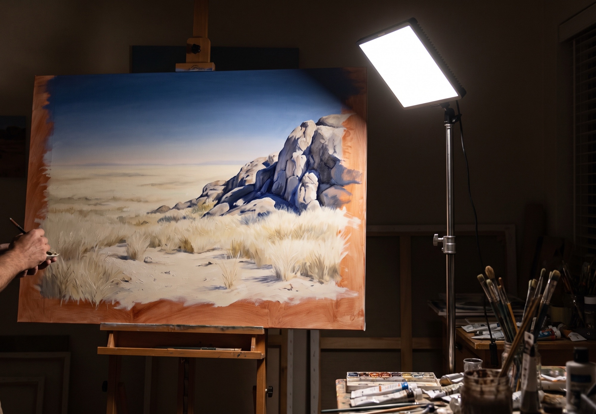
You cannot paint the sun. You paint what it does.
Under studio light, the whitest paint on the palette reflects roughly a hundredth of the light coming off sunlit sand. So the sun has to be built from relationships: how far the lights sit above the shadows, how warm sits against cool, and where colour is allowed to be strong. Get those three right and even quiet, greyed mixes will feel like they are baking.
This is the method we keep by the easel for painting African animals and landscapes indoors, in oil or acrylic, from photographs, sketches or memory. The full playbook, with swatches, value targets and the checklist, is at the end of this page.
Why tube colour fails
Paint comes out of the tube at its strongest: full chroma, middle value. Sunlight does the opposite. It bleaches what it hits, pushing the lit planes high in value and draining their colour.
Yellow ochre straight from the tube sits near the middle of the value scale. Paint dry grass with it and the scene reads as a poster, or as late afternoon, never as noon. The fix is not brighter paint. It is paler, greyer lights and much darker shadows.
Measured on a value scale of 0 to 10, a tube-strength version of a sunlit scene spreads about three and a half steps between its darks and its lights. The same scene painted for sun spreads nearly eight. The colour is quieter, yet the light reads stronger, because the gap is more than twice as wide.
Lever one: value
Value carries the sun. Put every big shape in its place on the scale first. Colour can only work inside the structure you give it.
| Passage | Value (0 black, 10 white) |
|---|---|
| Shadows | 3 to 5, cool, dark and connected |
| Upper sky | 4 to 6, darker than you expect |
| Halftones | 5 to 7, where the colour peaks |
| Horizon sky | 7 to 8, pale and greyed |
| Lit ground: sand, grass, rock, hide | 8.5 to 9.5 |
| Pure white | 10, one or two accents only |
- Compress the lights. Keep the lit ground within one or two steps of itself. Variety inside the light kills the glare.
- Open the gap. Drop the shadows four or more steps below the lights. That gap is the signature of direct sun. Overcast light shrinks it to one or two.
- Hold the shadows down. Indoors, the urge is to lift shadows to show detail. Resist it. Detail inside a sunlit shadow is dark and low in contrast.
- Mind the sky. At noon over pale ground, sunlit sand and grass are often lighter than the sky overhead. The sky is palest and greyest at the horizon.
- Save pure white. If white is everywhere, nothing glows.
Design the light in two values
Before any colour, reduce the scene to two families: everything in light and everything in shadow. If that pattern reads as sun in black and white, colour will follow. Add a third value for the sky or the far distance only once the two-value design works. This is the Japanese idea of notan, the balance of light and dark shapes, and it is the fastest check there is.
- Squint until detail disappears and only big masses remain.
- Thumbnail small: postcard size, one dark mix, ten minutes at most.
- Group, do not describe. Link shadows into connected shapes. Islands of dark scatter the light.
- Keep the light big. One large, simple light shape beats many small ones.
The phone shortcut: photograph your reference, switch it to mono and push the contrast to maximum. You get a rough two-value study in seconds. Use it to check your thumbnail, never to replace it. The thumbnail is where you decide which shapes to join and which to leave out.
Lever two: temperature
Every shadow outdoors is lit by the blue sky, so it leans blue-violet. Then the sunlit ground throws warm light back into it. Three temperatures side by side read as heat.
- Lit sand. Pale ivory-gold, very high in value and low in chroma.
- Cast shadow. Cool blue-violet, four or more steps below the light.
- Bounce light. Warm ochre creeping into the shadow from the lit ground around it.
- Warm rim. A thin, saturated warm line where shadow meets light. Use it sparingly.
Under direct sun, cast shadows are crisp where they touch the object and soften as they travel away from it. Soft edges everywhere read as overcast. At noon the sun is close to white-gold and shadows are short. In the first and last hour it turns orange and shadows stretch. Choose one time and keep every temperature true to it.
Lever three: chroma
The instinct is to put the strongest colour in the lights. In strong sun it belongs elsewhere: in the narrow band where form turns from light into shadow, and in the warm light reflected up into the shadow.
Across a sunlit rock the sequence runs: bleached cream in the light, orange-sienna at the turning edge, cool violet-grey in the core shadow, warm reflected light bounced up from the ground, and the darkest, coolest note in the cast shadow where it meets the rock. The lights are the quietest colour on the form. Strength peaks at the turn, then rises again in the bounce.
The mixes
Proportions are by volume and approximate. Mix the light first, on a clean part of the palette, and test it against the shadow before it goes on the canvas.
Dry grass. In light: 8 white, 2 yellow ochre, half raw sienna, a speck of violet or ultramarine. On the palette it should look almost grey next to pure ochre; in the painting it will read as sun. Turning edge: raw sienna, yellow ochre, a touch of cadmium red light, little white. In shadow: ultramarine, raw sienna, violet, a touch of white. Olive-violet, never black.
Sand. In light: 9 white, 1 yellow ochre, a hint of burnt sienna. Warm sunlit sand with ochre, not with yellow; yellow turns it acid. Cast shadow: ultramarine, burnt sienna, white, leaned blue-violet. Bounce at the edge: the shadow mix plus ochre.
Granite and rock. Lit side: white, raw sienna, a touch of cadmium red light. Turning edge: burnt sienna, cadmium red light, yellow ochre. Shadow side: ultramarine, burnt sienna, less white. Reflected light: shadow mix, ochre, white, low in the shadow facing the ground.
Sky. Upper sky: ultramarine, cerulean, white. Horizon: cerulean, white, a touch of ochre to grey it. Over pale ground at noon the upper sky is darker than the lit ground.
Savanna greens. Avoid tube greens; savanna greens are olive-grey, never emerald. Sunlit leaf: yellow ochre, ultramarine, plenty of white. Olive mid-tone: cadmium yellow light, ultramarine, burnt sienna. Acacia shadow: ultramarine, raw sienna, a little ochre.
Lion hide. The tawny colour you know lives only in the halftone and in the bounce under the belly. Lit back: white, yellow ochre, a touch of cadmium red light. Halftone: yellow ochre, raw sienna, cadmium red light. Shadow: ultramarine, burnt sienna, white. Belly bounce: the shadow mix plus ochre, lit from the sand below.
Elephant hide. In sun an elephant is a warm pale grey, far lighter than its local colour. Lit side: white, burnt sienna, a little ultramarine. Shadow: ultramarine, burnt sienna, a little white.
Zebra. A black stripe in sun and a white stripe in shadow sit far closer in value than you expect. White stripe in shadow: white, ultramarine, a touch of burnt sienna. Black stripe in sun: ultramarine, burnt sienna, a little white.
The palette
Nine colours and a clean knife: titanium white, yellow ochre, raw sienna, cadmium yellow light, cadmium red light, burnt sienna, ultramarine blue, cerulean or cobalt, dioxazine violet.
Before the first stroke, mix three or four generous piles: grass light, sand light, rock light and one shadow. Give each its own knife or brush. Dirty lights kill the effect faster than anything. Warm every white with a speck of ochre or cadmium yellow light; titanium white straight from the tube looks cold and chalky beside sunlit colour.
Working indoors
Daylight bulbs at 5000 K with a colour rendering index of 90 or more, aimed at the canvas from above and to one side. Under warm household light you over-correct, and the painting looks chalky and blue in daylight.
Work on a warm toned ground, a thin wash of burnt or raw sienna. Lights laid over it glow, and it shows at once whether a light is light enough. If you paint in acrylic, mix the lights a shade lighter than you want; they dry darker.
The playbook
The complete edition, with swatches for every mix, the value targets and the easel checklist:
- Painting the African Sun, A4 print edition (PDF, 22 MB)
- Painting the African Sun, 12-slide edition (PDF, 18 MB)
The example paintings in the playbook and the image at the top of this page are AI-generated illustrations made to demonstrate the method. They are not studio work.